Member-only story
Sunburst Chart in Tableau for Hierarchical Data

This is another blog in the series of Advanced and Interactive Visualization using Tableau, that can add an edge to your Tableau skills and help create an impact in the presentation Reports and Dashboards.
This is about — Creating a Sunburst Chart for dosplaying Hierarchical data.
Sunburst Charts basically belong to a family of Pie Charts.
Here, each level of the hierarchy is represented by one ring or circle with the innermost circle as the top of the hierarchy. A sunburst chart without any hierarchical data (one level of categories), looks similar to a doughnut chart.
Hence, it can be created as similar to a Doughnut chart in Tableau, that is by using Dual Axis in 2 pie charts.
But this technique doesn’t give you the flexibility to work on multiple levels of hierarchy, and is mostly limited to 2 levels.
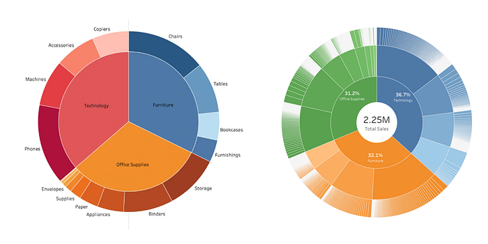
Below picture gives an idea of Sunburst chart with Dual Axis (on the Left) and the Sunburst Chart with the 2nd technique (on the Right).

As one can see, the left chart has 2 levels but the right one have 4 rings displaying 4 levels of hierarchy. This is more insightful and gives more power to the user while displaying the required information.
The right one has been created using Multiple Map Layers. This technique not only help in Geospatial analysis, but can also be used to create Advanced Charts. We will see how to utilize this technique to create a Multi-layered Sunburst Chart to display our hierarchcal data.
To show this, I’ll be using the US Superstore Dataset available on Tableau and build a Sunburst chart to show Sales hierarchy of Category > Sub-Category > Product.
Let’s Begin…
Step 1) The First Layer
We will begin by creating our 1st Map Layer, to display the Sum of Sales for each Category of Products.
